I am starting with the horrifying site: The Topography of Terror
From Visit Berlin: “Remembering terror and persecution – the documentation centre Topographie des Terrors is one of the most-visited places of remembrance in Berlin.
A place where terror is tangible, a place of remembrance and a warning from history, the “Topography of Terror” exhibition is located on the site where between 1933 and 1945 the principal instruments of Nazi persecution and terror were located: the headquarters of the Gestapo, the high command and security service of the SS, and from 1939 the Reich Security Main Office.”
A description from Germany/travel: “The Topography of Terror is different to the other places of remembrance relating to the rule of Fascism in Berlin because it is the site of the perpetrators. The exhibition at the heart of the capital city informs visitors about the headquarters of the SS and police state, which makes the European aspect of the Nazi reign of terror all the more real.
The site that has been home to the Topography of Terror since 1987 was once used to plan and govern the majority of crimes committed by the Nazis. Between 1933 and 1945, the main institutions of the Nazi instigators of terror, the SS and Gestapo, could be found here. Having been partially destroyed during the war and then changed beyond all recognition later on, this historical site was gradually added back into Germany’s memory of its past from the 1980s onwards. “
The major focus of the permanent exhibition of the “Topography of Terror” is on the central institutions of the SS and police in the Third Reich and the crimes they committed across Europe. The exhibition panels mostly present historical photographs supplemented by introductory texts and short quotes. Under the panels are consoles where thematically arranged documents are displayed.
It was actually quite a horrifying visit. I can’t bring myself to share any of the stories. That said, I think it is important to visit places like this. If you go to Berlin, gird your loins and go.
Now let’s move to the confusing site: The Memorial to the Murdered Jews of Europe.
Let’s start with the facts: The monument is composed of 2,711 rectangular concrete slabs (or stelae), laid out in a grid formation, the monument is organized into a rectangle-like array. This allows for long, straight, and narrow alleys between them, along which the ground undulates. The stelae are 7 ft 9 ½ inches long, 3 ft 1 ½ inches wide and vary in height from 8 inches to 15 ft 5 inches. The site occupies an entire 205,000-square-foot city block.
The rest is open to interpretation.
I visited this site by myself. I did not understand what it was trying to tell me. It wasn’t sad, it wasn’t overpowering. I wasn’t moved by it. I wasn’t reminded of anything. It just was.
First, let me share some pictures and give you an opportunity to experience it for yourself, which you can’t really do since it is 2D and far too small, but . . .
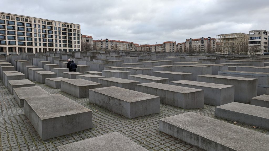
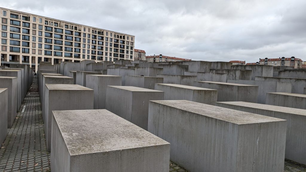
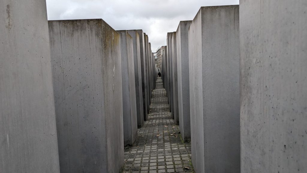
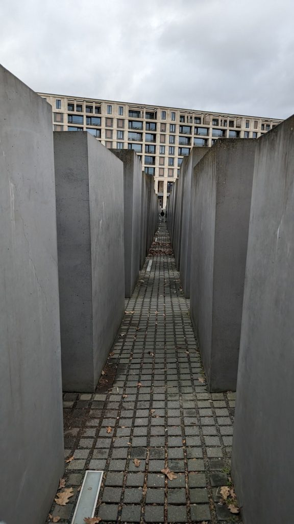
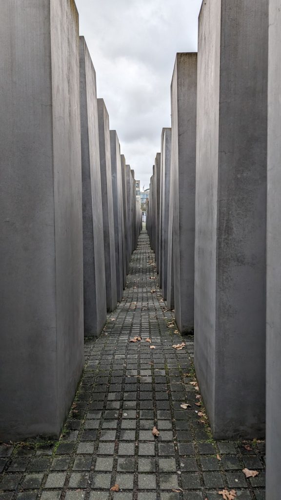
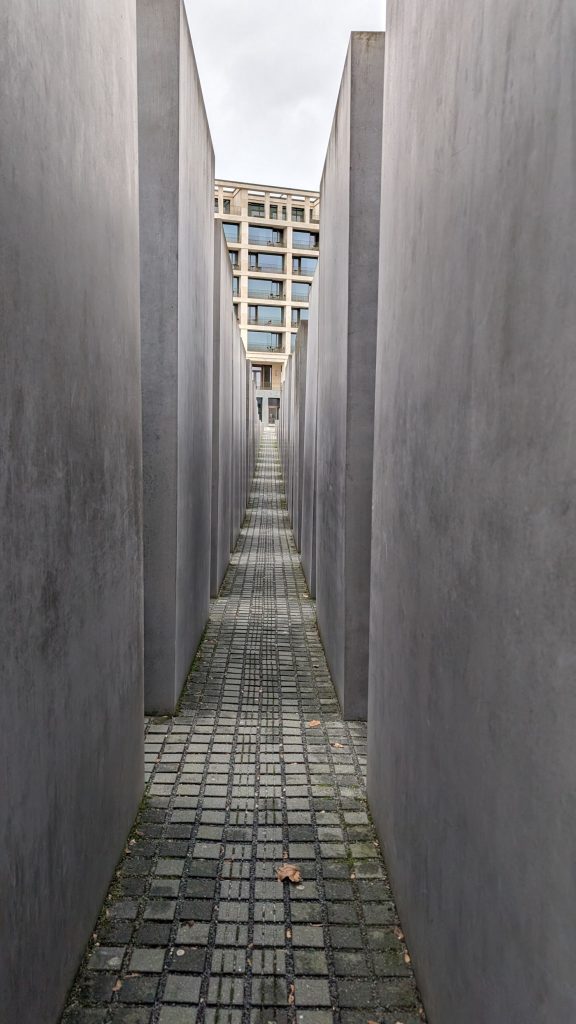
As you can see from the street level view, the height of the pillars does not appear to change drastically. But once you begin to walk between them, the pillars increase significantly in height due to both the undulating ground and the actual size of the pillars.
The pillars contain no writings. No pictures. No names. Nothing.
Once in a while you see other humans but other times you are alone with your thoughts. There were few people when I visited, for which I am grateful. Although, as I said, the additional time allotted to ruminating did not provide a clue to the purpose of the site.
At one point I saw a stairway leading down and thought, “Ah, this is where the explanation lies.” But it was blocked off, so it was of no use to me.
I read about this site after visiting it and found that I was not alone in not understanding its meaning or purpose. This information is extracted from the Interpretations section of the site on Wikipedia.
According to Eisenman’s project text, the stelae are designed to produce an uneasy, confusing atmosphere, and the whole sculpture aims to represent a supposedly ordered system that has lost touch with human reason. The Memorial to the Murdered Jews of Europe Foundation official English website states that the design represents a radical approach to the traditional concept of a memorial, partly because Eisenman said the number and design of the monument had no symbolic significance.
However, observers have noted the memorial’s resemblance to a cemetery. The abstract installation leaves room for interpretation, the most common being that of a graveyard. Many visitors have claimed that from outside the memorial, the field of gray slabs resembles rows of coffins. While each stone slab is approximately the size and width of a coffin, Eisenman has denied any intention to resemble any form of a burial site. Wolfgang Thierse, the president of Germany’s parliament the Bundestag, described the piece as a place where people can grasp “what loneliness, powerlessness and despair mean.” Visitors have described the monument as isolating, triggered by the massive blocks of concrete, barricading the visitor from street noise and sights of Berlin.
Some visitors and Berliners have also interpreted the contrast between the gray flat stones and the blue sky as a recognition of the “dismal times” of the Holocaust. As one slopes downwards into the memorial entrance, the gray pillars begin to grow taller until they completely consume the visitor. Eventually, the gray pillars become smaller again as visitors ascend towards the exit. Some have interpreted this as the rise and fall of the Third Reich or the Regime’s gradual momentum of power that allowed them to perpetrate such atrocities on the Jewish community. The space in between the concrete pillars offers a brief encounter with the sunlight. As visitors wander through the slabs the sun disappears and reappears. One is constantly tormented with the possibility of a warmer, brighter life. Some have interpreted this use of space as a symbolic remembrance of the volatile history of European Jews whose political and social rights constantly shifted.
As you can see, it’s kind of open to interpretation.
I learned that I would have understood a lot more had the underground information center been open. This is what I read: “The visitor display begins with a timeline that lays out the history of the Final Solution, from . . . 1933 through 1941. The rest of the exhibition is divided into four rooms dedicated to personal aspects of the tragedy, e.g. the individual families or the letters thrown from the trains that transported them to the death camps. The Room of Families focuses on the fates of 15 specific Jewish families. In the Room of Names, names of all known Jewish Holocaust victims obtained from the Yad Vashem memorial in Israel are read out loud. Each chamber contains visual reminders of the stelae above: rectangular benches, horizontal floor markers and vertical illuminations.”
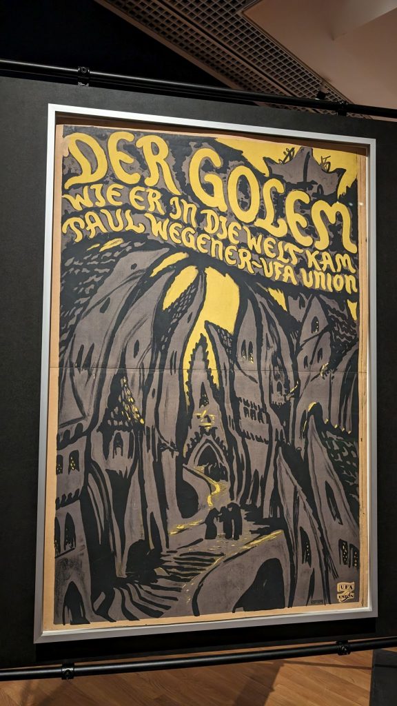
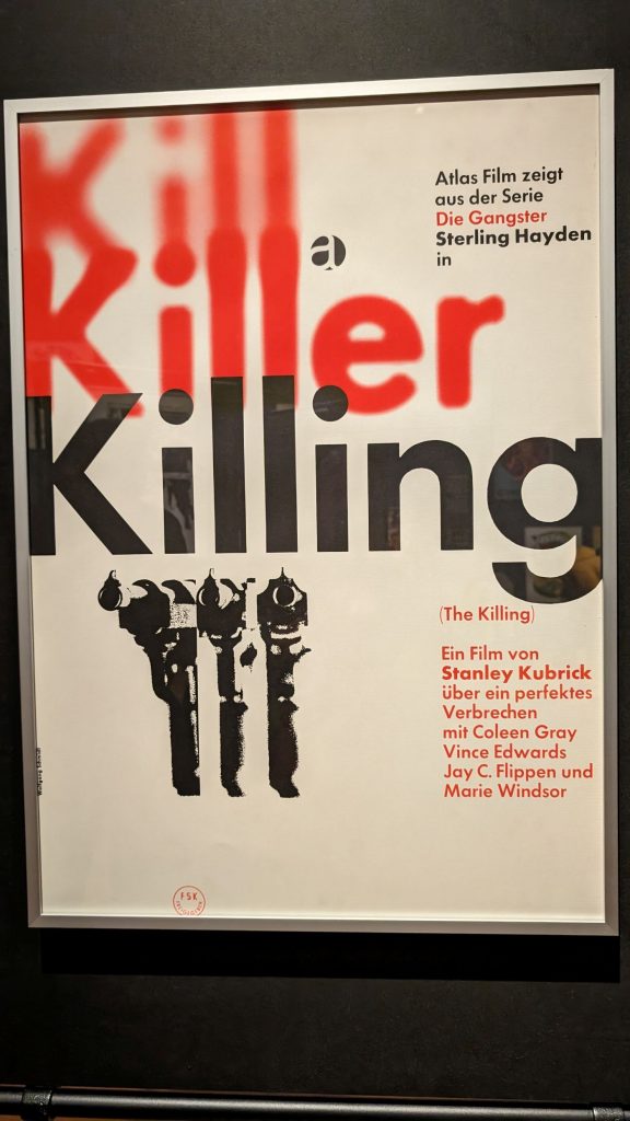
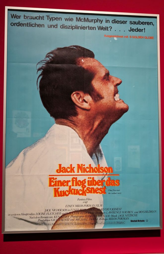
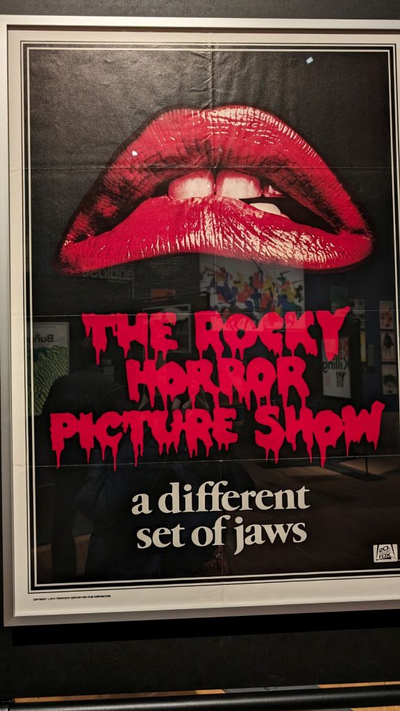
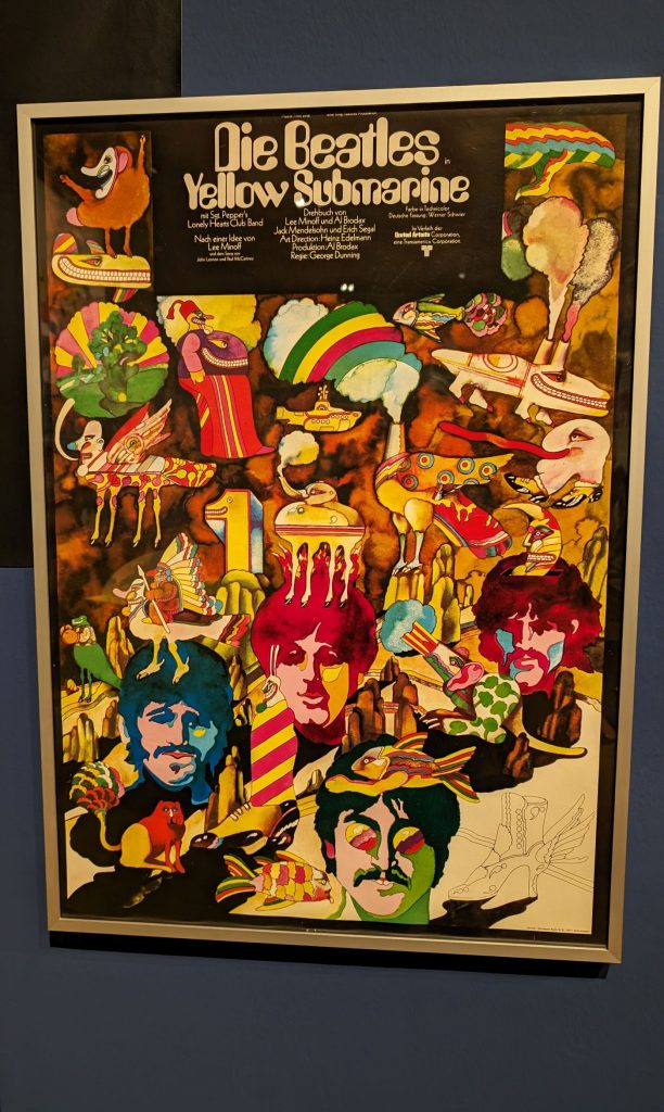
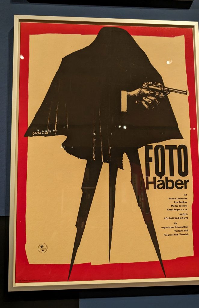
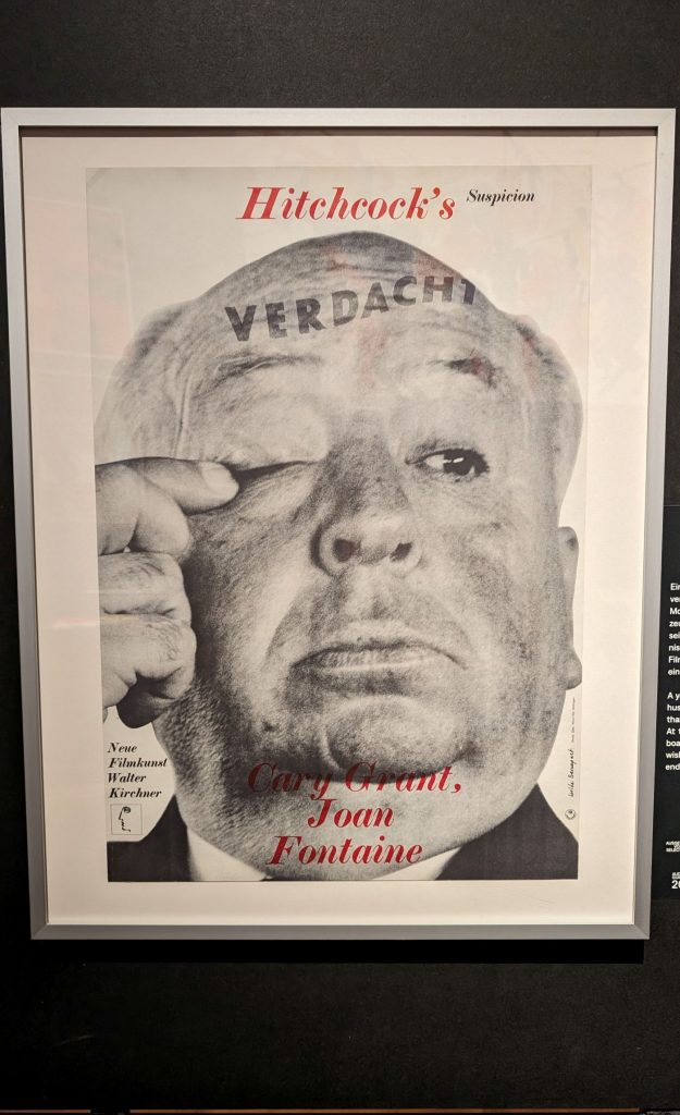
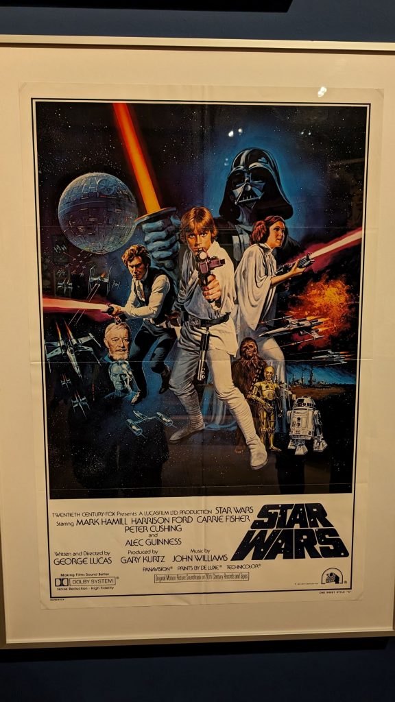
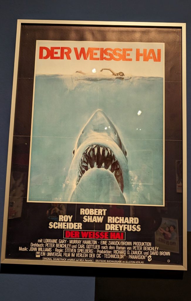
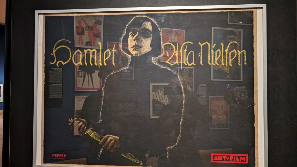
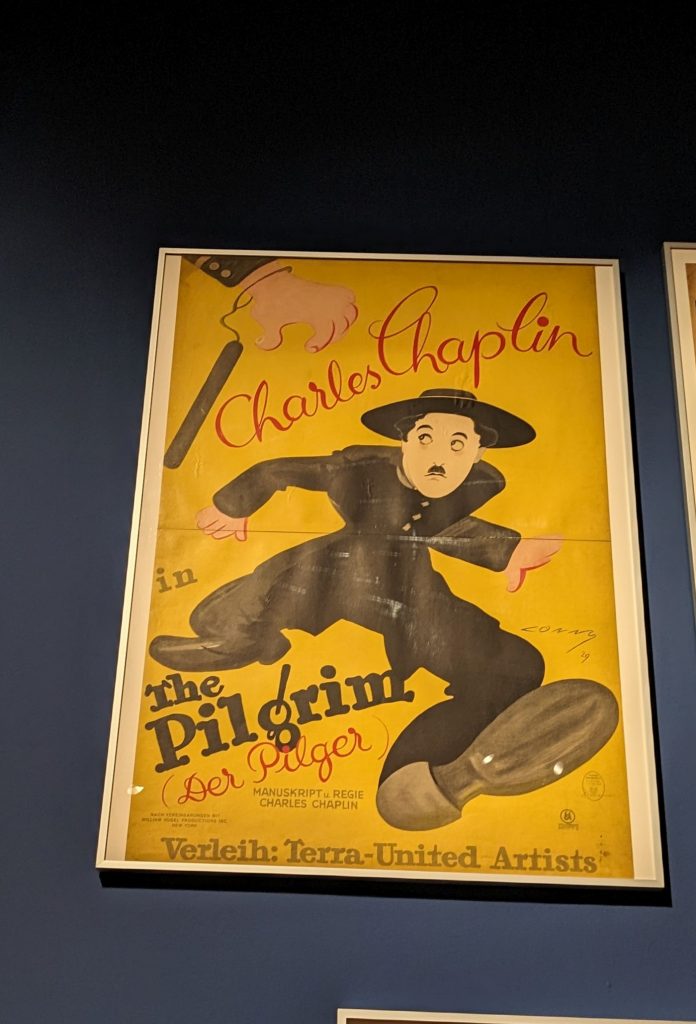
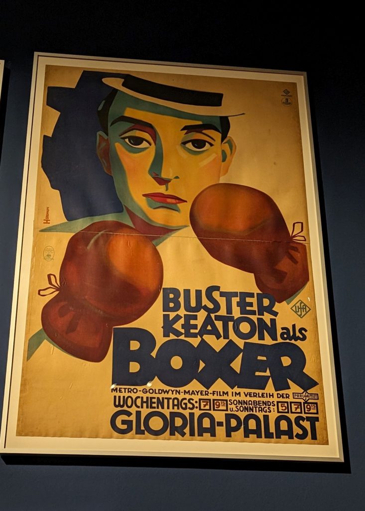
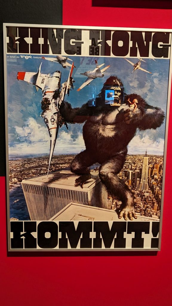
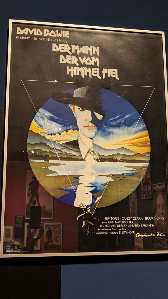
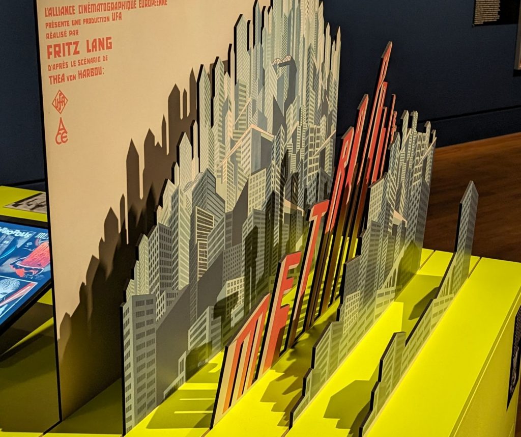
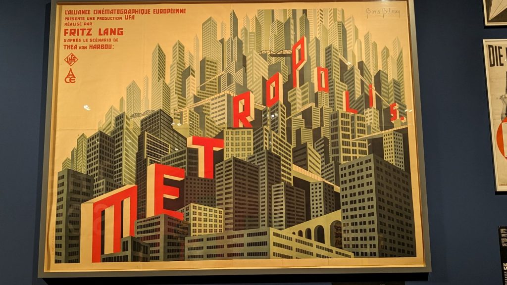
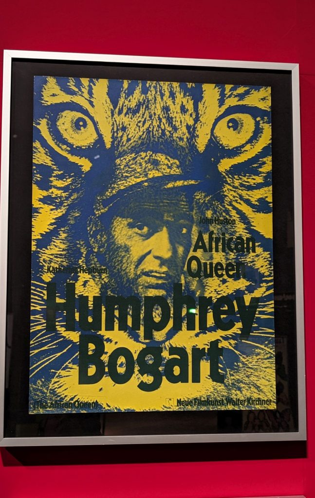
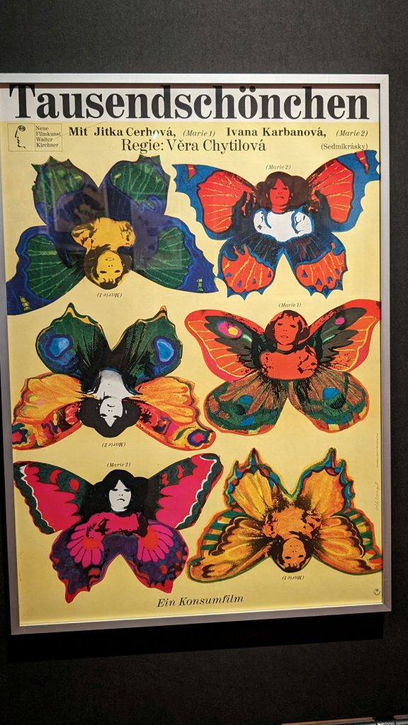
Let’s move on to a fun site. Sometimes I see something quirky or different when I look for places to visit. (Think Toy Museum, Bread Museum, Catacombs.) I found one in Berlin. “The Big Screen Film: Posters of All Time” presents 300 original film posters from the 1900s to the 2020s from the graphic design collection of the Berlin Art Library.
From Visit Berlin:
“Posters have been central media in the communication of film ever since cinema existed: They bring cinema to the streets and arouse emotions on a grand scale.
A Graphic Snapshot
A cinema film needs a poster – even in digital times it is the most important medium of visual communication. A good film poster is both advertising and art:
It condenses the plot of the film into a single concise image, captures atmosphere and introduces protagonists. Without revealing too much, it arouses curiosity. In short: film is translated into graphics here, along with all the emotions of “big cinema”.
Film posters make you marvel, smile or frown, they stir up tension, memory, excitement or admiration.
…of all times
Shortly after the invention of the cinematograph, the first film posters were used in urban spaces around 1900. The exhibition traces a history of the film poster from 1905 to the present day: from narrative and expressionist lithographs in silent cinema to the world-famous modern graphics for New Film Art and Atlas in the 1960s to current design between paper and pixel.
Besides German posters, France, the USA, Poland and other countries are represented. The spectrum spans twelve decades – in the truest sense of the word: film posters of all times!
Professionals and celebrities
What makes a good film poster is very much in the eye of the beholder, has to do with taste, and with personal experience. That’s why the exhibition is curated collaboratively: 26 people from the film and cinema industry helped select the exhibits from the approximately 5,000 film posters in the Graphic Design Collection.
Together with the Berlinale management, nominated guests from the fields of acting, directing, cinema business, film studies, art and graphic design were each invited to choose a favourite poster.
A special exhibition by the Kunstbibliothek – Staatliche Museen zu Berlin in cooperation with the Berlin International Film Festival and the Deutsche Kinemathek.”
Let’s get right to (some of) the posters. I am sharing them without comment. How many do you remember? Why do you think they were selected for the exhibit? Do they want to make you watch the movie? Do they make you want to NOT watch the movie?
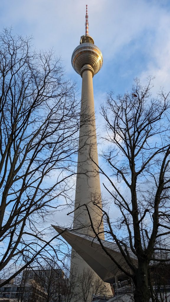
We concluded our visit to Berlin with a visit to (and up) the Berliner Fernsehturm, which translates to “Television Tower” in English. It’s the tallest television tower in central Berlin, standing at 368 meters tall. The tower was built between 1965 and 1969 by the East German government to broadcast color television and improve the country’s broadcasting signals. It also served as a symbol of the technological advancements of the East during the Cold War.
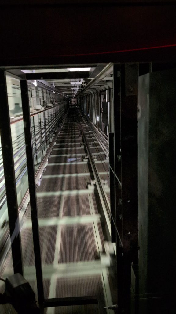
There is no walking to the top of the tower, you travel by lift.
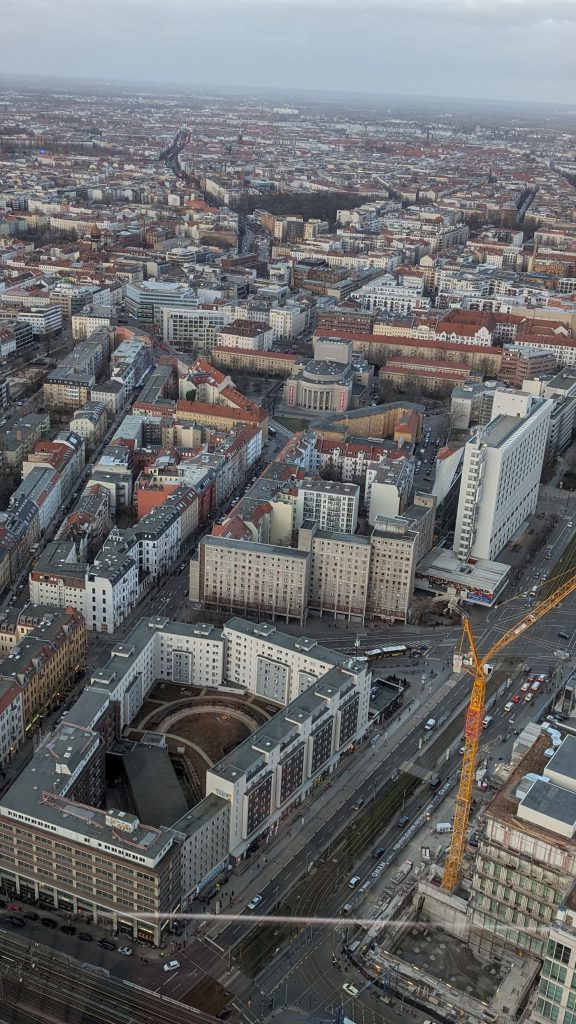
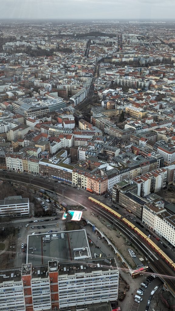
The 360 degree view of Berlin from the top is nice.
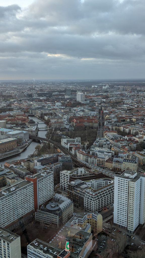
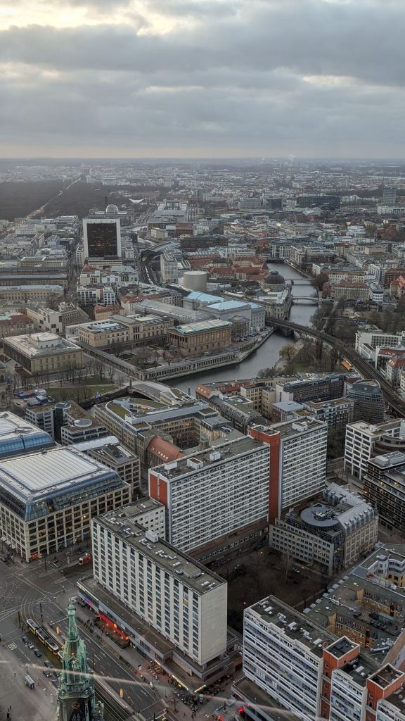
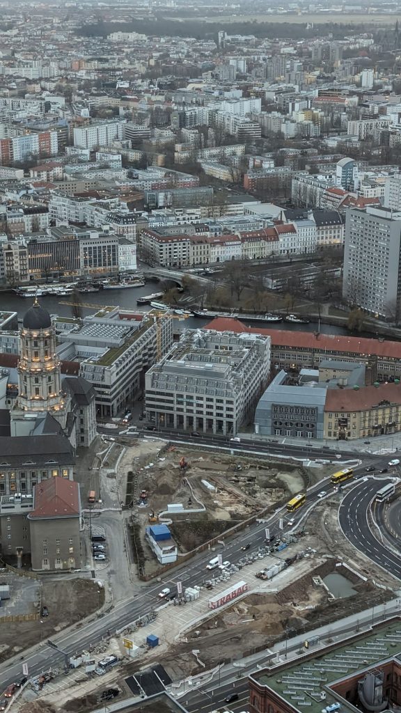
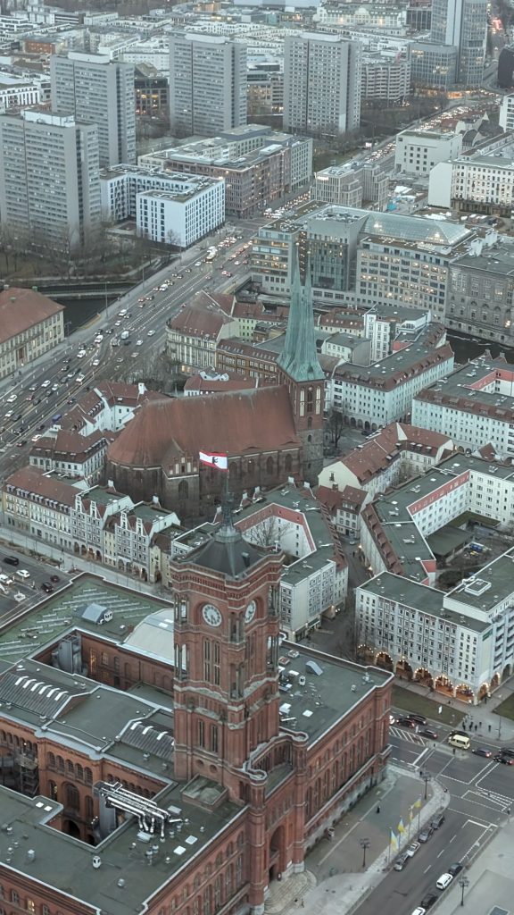
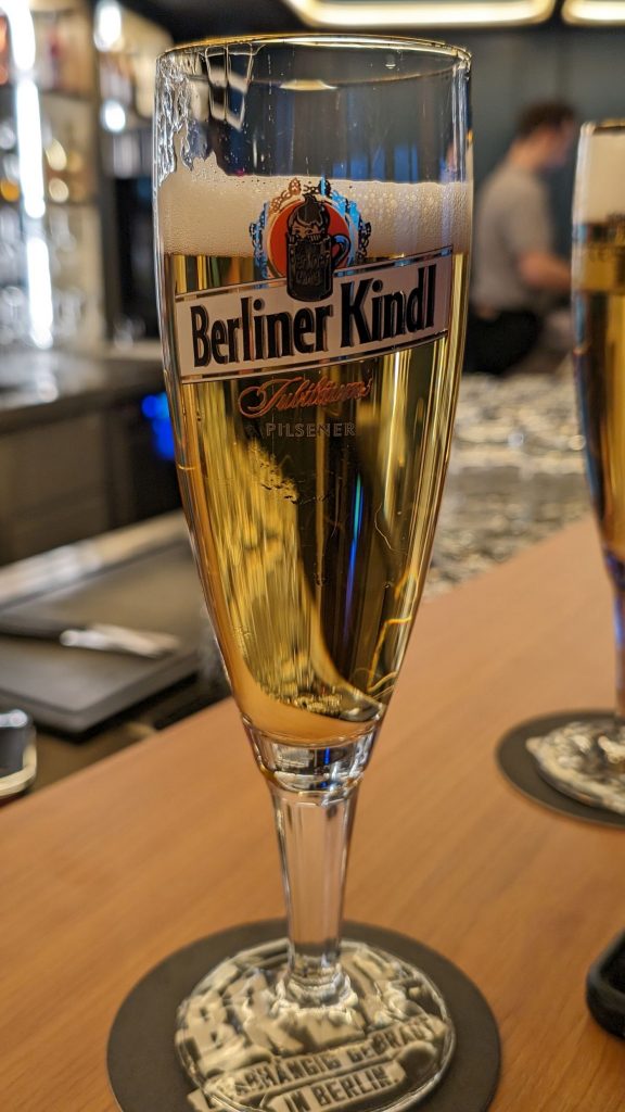
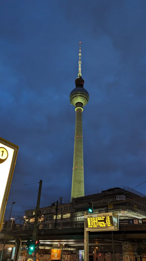
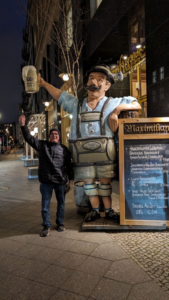
I wasn’t entirely accurate when I said we ended the day at the tower. We actually ended it at a beerhouse.
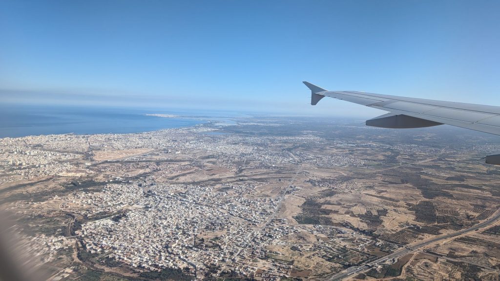
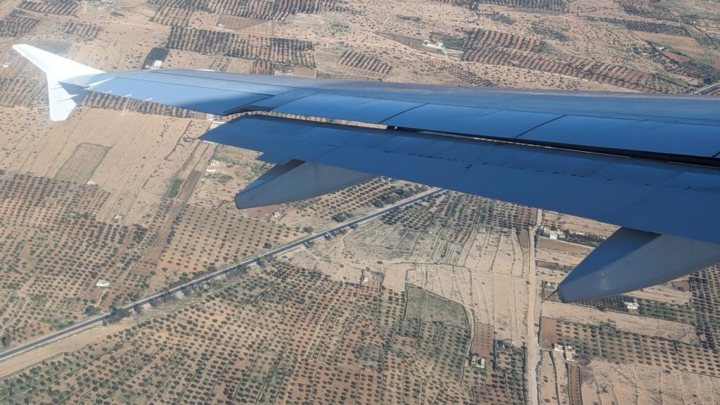
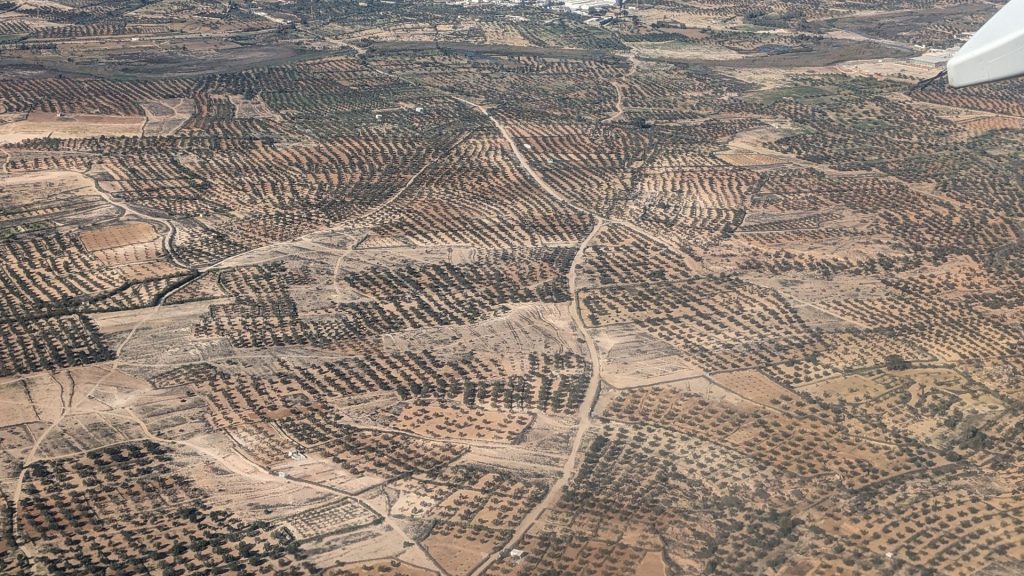
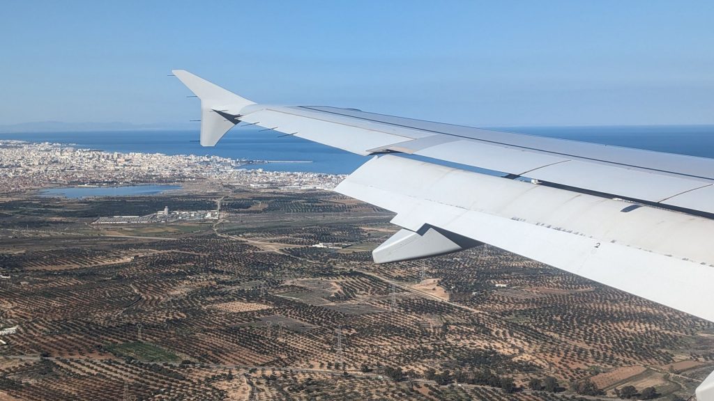
We flew back to Tunisia the next day. From cold, mostly cloudy and windy to sunny and warm, but very brown. 🙂
I will share a bit about Seahike’s makeover and our trip to France in the next couple of blogs. See you then!
